Exploring Color Elements of Design
Color design is the foundation that leads a piece of work to be visually appealing and efficient. It is powerful: it evokes emotions, alters perceptions, and drives the actions of the user. Knowing how color design can create a better look and better usability for projects is the secret to creating professional projects. Well-chosen colors can turn any layout into a dynamic experience, guiding the viewer's eye and creating cohesion in the narrative. Through thoughtful color decisions, designers are able to ensure their work is not just beautiful but conveys the right message.
How Color Influences Visual Perception
Color is one of the most essential elements in shaping our visual perception, influencing how we interpret and respond to the different design components. A number of factors go into the color definition in design, which makes this effect so powerful:
- Directional Attention: Vivid, contrasting colors can quickly draw attention to important areas, guiding the viewer's eye toward relevant information.
- Brand Identity: Consistent color schemes in marketing will establish and build an easily recognizable brand identity.
- Emotional Response: Colors can evoke certain emotions; for example, blue can connote calmness, while red can connote urgency or passion.
- Visual Hierarchy: Perfect use of color can develop a visual hierarchy, hence making it easier for users to navigate and understand the content.
Understanding these color design elements helps professionals create more interesting and efficient visuals that convey deep messages to viewers.
The Role of Color in User Reactions and Actions
Colors play a huge role in the behavior of users, and they can have subconscious impacts on what decisions a user would make or actions they would take. Such color definition design principles enable designers to make conscious color choices that spur the users toward specific actions, such as making a purchase or pointing out an important feature. It helps designers create intuitive and impactful interactions that increase user satisfaction and engagement.

Understanding Design Terms for Effective Use of Color
Mastery of color usage in design comes with clarity in important design terms and conditions that specify the relationships and characteristics of colors. These terms and conditions are literally the directions toward guiding designers in generating visually pleasing harmonies. This allows designers to make the right decisions that achieve better aesthetics and functionality in their works. Understanding such basic terms gives designers the power to create more dynamic and coherent designs that do exactly the job they are supposed to do.
Exploring Color Properties in Design
Understanding Color Properties is essential for creating an effective and visually pleasing design. Each property contributes to how we perceive and interact with color, shaping the overall impact of the design. Let's look closer at these important properties:
- Hue concerns the pure spectrum colors. It is the first step toward the color definition design process.
- Saturation measures the intensity or purity of a color and, to a great extent, affects how vibrant or subdued it looks.
- Value refers to the lightness or darkness of the color. The meaning is determined by the value within a design, which is related to the definition of color change.
- Chroma measures the purity of a hue compared to gray; it could change the general colorfulness.
- Temperature categorizes colors as warm or cool, hence the evocation of a different emotional response.
Mastering these properties allows designers to manipulate colors into visual and emotional effects to create the desired result and enhance the overall design.
The Significance of the Color Wheel
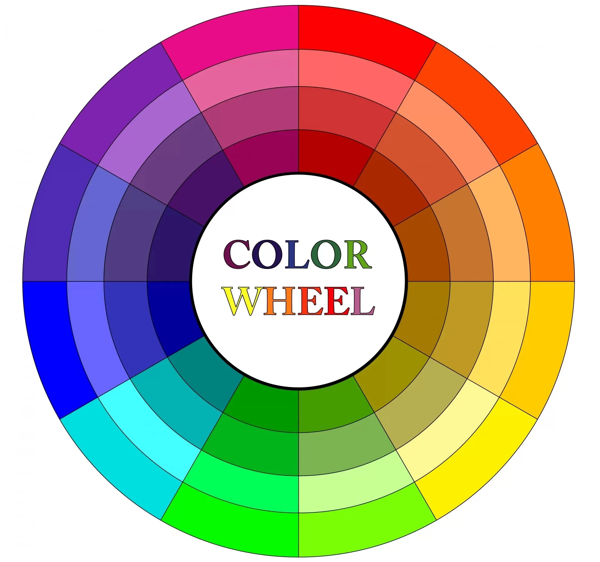
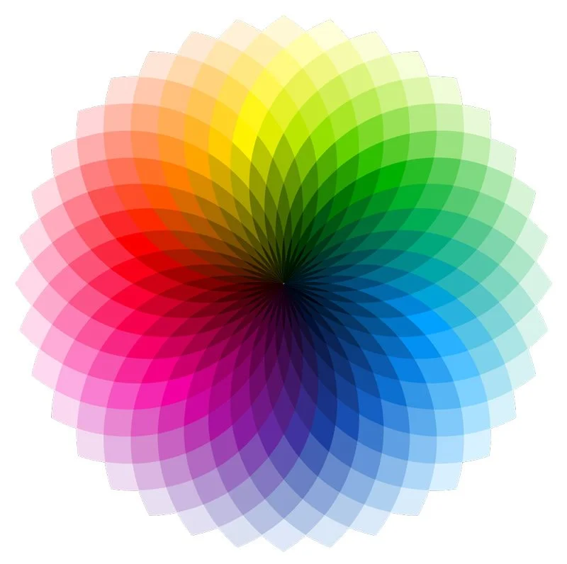
The color wheel is one of the core tools in the world of design. It visually demonstrates how colors relate to each other. A color wheel chart enables a designer to understand color relationships and how to combine them harmoniously and in balance. It helps designers navigate the complexities of color theory and ensures that their project is visually appealing and cohesive. The color wheel shows how primary, secondary, and tertiary colors are related, therefore providing a clear understanding of different color combinations.
Besides color selection, the color wheel also helps when trying to understand design terms and conditions in color harmony. It is much easier to grasp the concept of complementary, analogous and triadic color schemes when referring to the wheel. This tool enables a designer to predict what color combination will look good together. That means no more guesswork in the design process; it becomes much more efficient. Mastering the use of the color wheel leads to more stunning visuals that actually communicate their intended message.

Differentiating Color Types
Identification of the color types helps designers create more dynamic and interesting visual pieces. Each color type has its role and effect on the picture, enhancing its overall effect. Primary colors are the basic elements for any designer to ensure strong and harmonious designs. Secondary colors are created by mixing the primary colors. Tertiary colors can be defined as colors created by mixing primary and secondary colors, adding extra depth to the color range.
The definition of color change also differentiates one color type from the other. Understanding those changes allows a designer to manipulate colors to achieve certain effects and moods. Understanding the insights of color types and their transformations will help designers develop better visual communication and more engaging designs.
Understanding Various Color Systems
The different color systems are used to achieve specific results in design and are unique in their way of mixing and applying colors. Any designer who needs to make proper and vibrant visuals must understand the different systems. Here are the primary color systems used in the design:
- RGB (Red, Green, Blue): This system combines light to produce a wide range of colors, following the color definition design principles for digital media. It is mainly used for digital screens.
- CMYK stands for Cyan, Magenta, Yellow, and Key/Black. This color-reduction system requires inks to be mixed together in a given ratio to achieve the desired color or shade.
- RYB - Red, Yellow, Blue - is the one taught in art education; it's the foundation for understanding basic color mixing.
- HSL: Hue, Saturation, and Lightness. This is a color system used in digital design. It defines colors based on human perception by adjusting hue, saturation, and lightness levels.
By mastering these color systems, a designer can ensure that their work looks consistent and effective across a variety of media, from print to digital displays.
Creating Harmonious Color Schemes
Developing harmonious color schemes is the very essence of creating visually appealing and practical designs. Website color schemes are critically important to user experience since they guide visitors' attention and elicit the intended emotions. By judicious choice of complementary, analogous, and triadic colors, designers can ensure a harmonious and balanced view that adds to a website's overall aesthetic value. These schemes help create a consistent visual language that parallels the brand's identity and message.
Understanding the definition of color change helps to provide harmony within a color scheme. Different tints and shades of a primary color can easily create an elegant and easily viewed monochromatic scheme. With these techniques, designers can create color schemes that are not only pleasing to look at but also support the functionality and purpose of the website.

The Impact of Color Definition in Design
The proper use of color in graphic design can drastically change the bottom line of success for a visual project. Colors are not just aesthetic choices; they are powerful tools that state the message, elicit emotions, and get reactions. Effective use of color in graphic design ensures a clear conveyance of the intended message and that resonance is evoked with the target audience. Understanding how different colors interact with each other and their psychological effects allows designers to create compelling visuals that capture attention and engage viewers. Mastering color definitions and their applications can escalate the level of your work to be more impactful and memorable.
The Long-Term Benefits of Effective Color Use
Effective color design transforms a project and delivers long-term advantages that go far beyond aesthetic value. Here are some significant benefits:
- Customer Trust: Continual use of a well-thought-out color scheme builds trust with your audience. Familiarity with your brand's colors reassures customers and enhances their feeling of reliability.
- Conversion Rates: Strategic color choices can directly impact conversion rates - for example, guiding users toward actions like buying or signing up for a newsletter. Properly selected colors can subtly influence decision-making processes.
- Mood Setting: Colors can set the mood and atmosphere of a design, hence creating an environment aligned with the brand's message. Whether it is soothing blue for a spa or energetic red for a sports brand, the right colors enhance the user's experience.
- Product Differentiation: In a market where there are many identical products, distinctive color design can make your product stand out. Unique colors can create an unforgettable impression and make customers remember to choose your product over competitors.
- Emotional Resonance: Colors can be evocative of specific memories and emotions, which create a deeper connection with your audience. This emotional resonance can convert the one-time visitor into a loyal customer who feels a personal connection with the brand.
Enhancing Design through Wise Color Choices
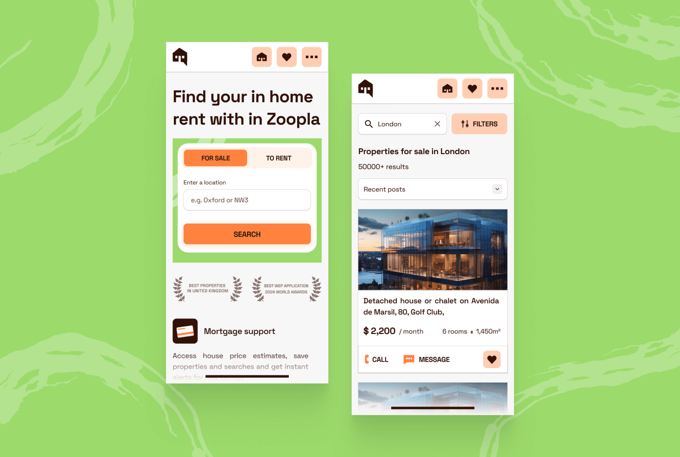
Choosing the right colors is essential for any design project. Proper color usage can considerably extend a website's aesthetics and functionality. By knowing how colors affect human emotions and behaviors, designers can develop more captivating and efficient visual content. This method ensures that the colors are harmonized with the brand identity and target audience, creating a deeper connection and a better overall user experience.
Moreover, good color choices make a website more user-friendly and accessible. Ideal color contrasts have an enormous effect on making the text or necessary elements readable, and this, in turn, helps users with the ability to browse through the site easily. It doesn't just raise the aesthetic value of a website but also raises its performance, and that leads to much higher user satisfaction and engagement. In other words, the importance of choosing and understanding colors can't be overestimated. Visit us at Integritas.agency to learn more about how expert color choices can transform your website.


