Upbeat AI
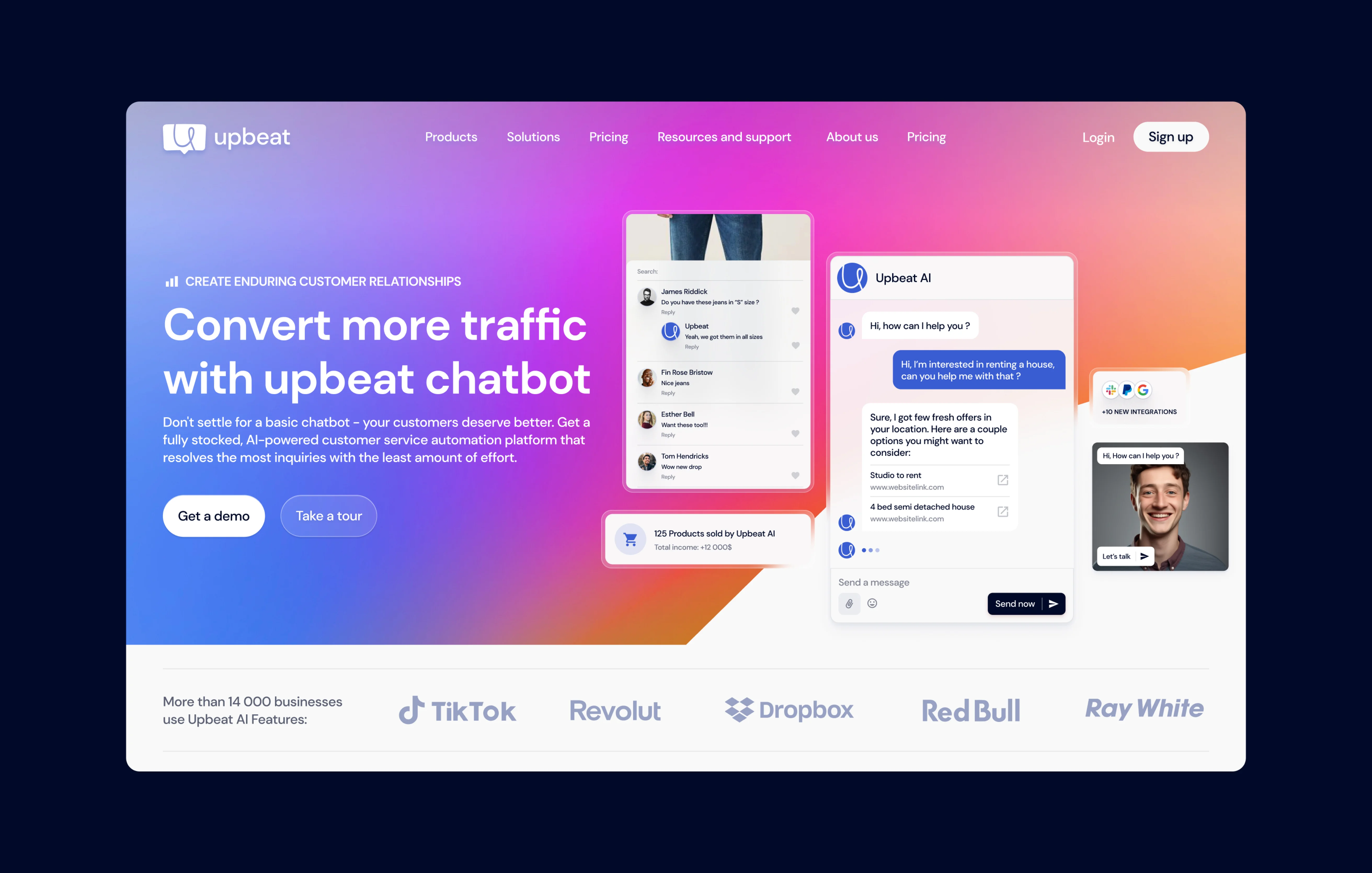
Here’s to Upbeat, the chatbot that changes everything. We set out to build more than just a website—we crafted an experience. Clean. Simple. Effortless. Every click, every interaction designed with one thing in mind: making AI more intuitive and engaging than ever before. It’s smart, it’s approachable, and it’s built to connect. This is not just another chatbot—this is a leap into the future of conversation. Ready to meet Upbeat? Let’s dive in.
ABOUT THIS PROJECT
Challenges and Solutions.


CHALLLENGE
In a digital world where first impressions matter more than ever, we were tasked with giving Upbeat a bold new look. The mission? To redesign and rebrand the website to outshine competitors and drive higher conversions. We needed to craft an experience that was not only visually stunning but also strategically engineered for results. On top of that, the design had to be SEO-optimized from the ground up, ensuring Upbeat stayed ahead in search rankings.
SOLUTION
Our approach was clear: create a website that doesn’t just compete but dominates. We overhauled the design with a fresh, modern look that captures attention while staying true to Upbeat's core identity. Every element was meticulously optimized for user flow, turning visitors into engaged users. By integrating SEO best practices right into the design, we built a site that’s as powerful under the hood as it is on the surface. The result? A website that’s built to win—faster, smarter, and ready to convert.
Branding
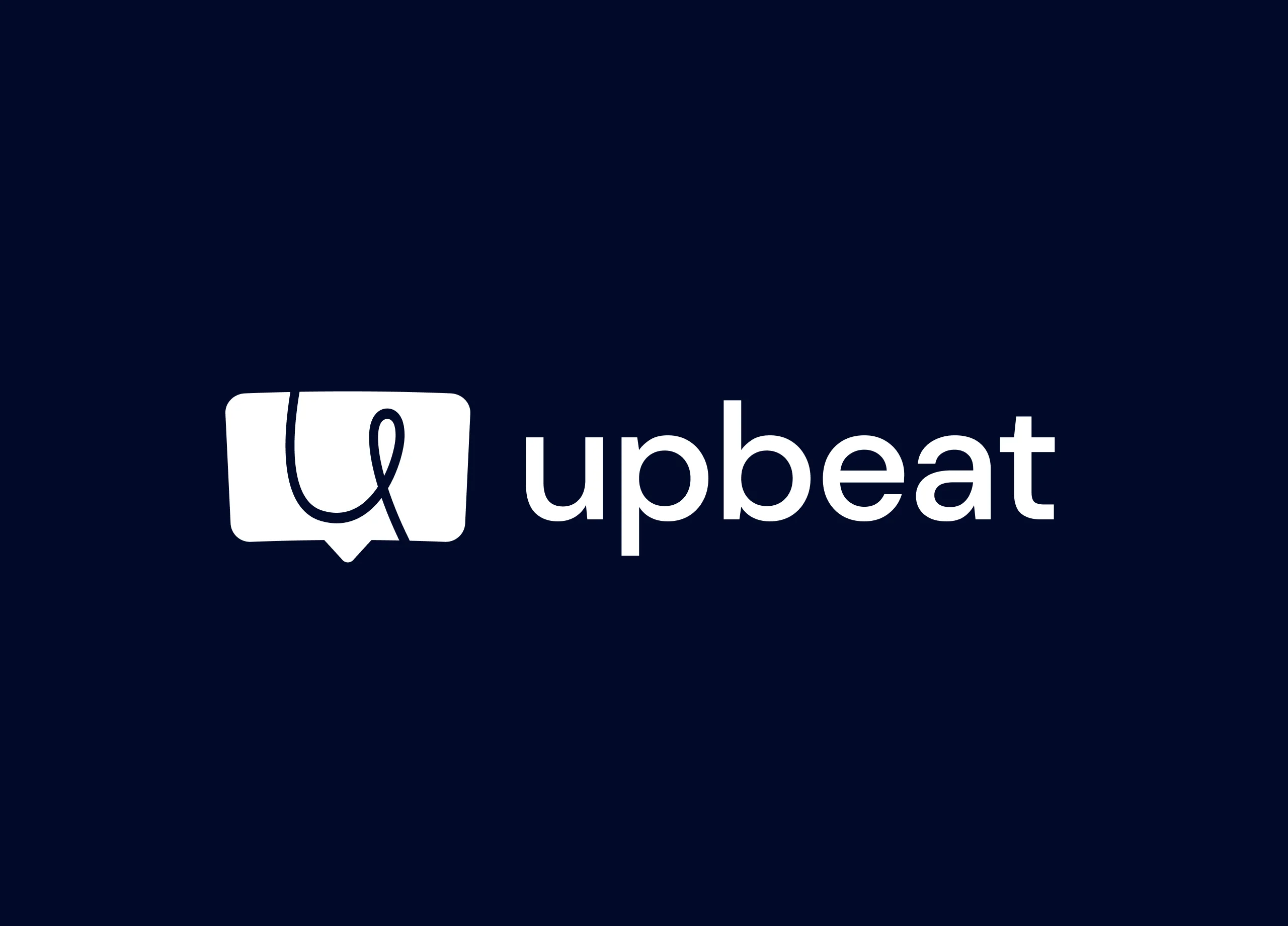
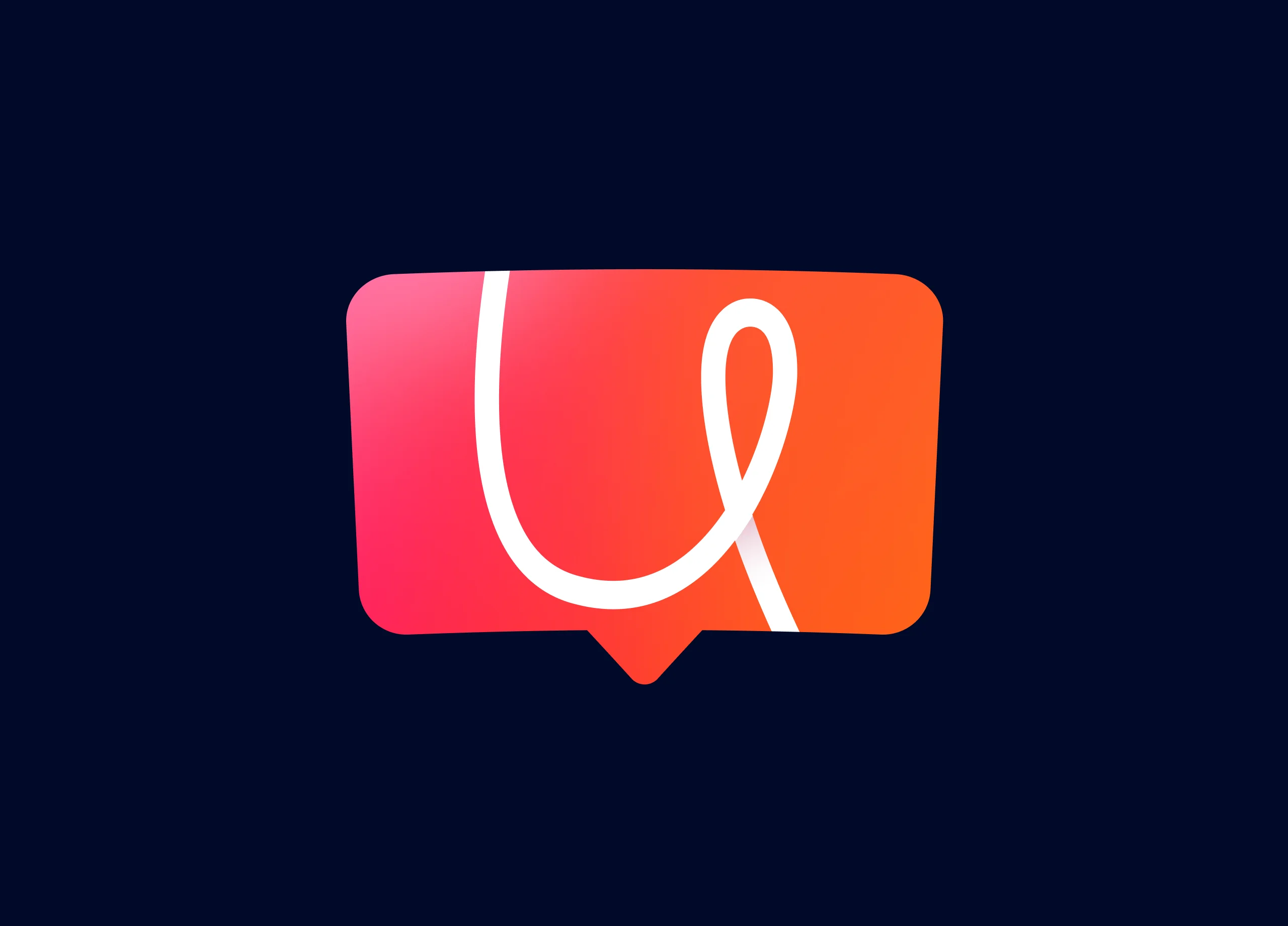
The Upbeat logo features a minimalist speech bubble icon in navy blue, with an abstract "U" shape integrated into the design. This symbolizes communication and interaction, central themes of the chatbot's functionality. The typography is clean and sans-serif, creating a professional yet approachable look. gradient-filled speech bubble, transitioning from pink to orange. The abstract "U" shape is retained, but this version is more fluid and dynamic,
UX UI Design process
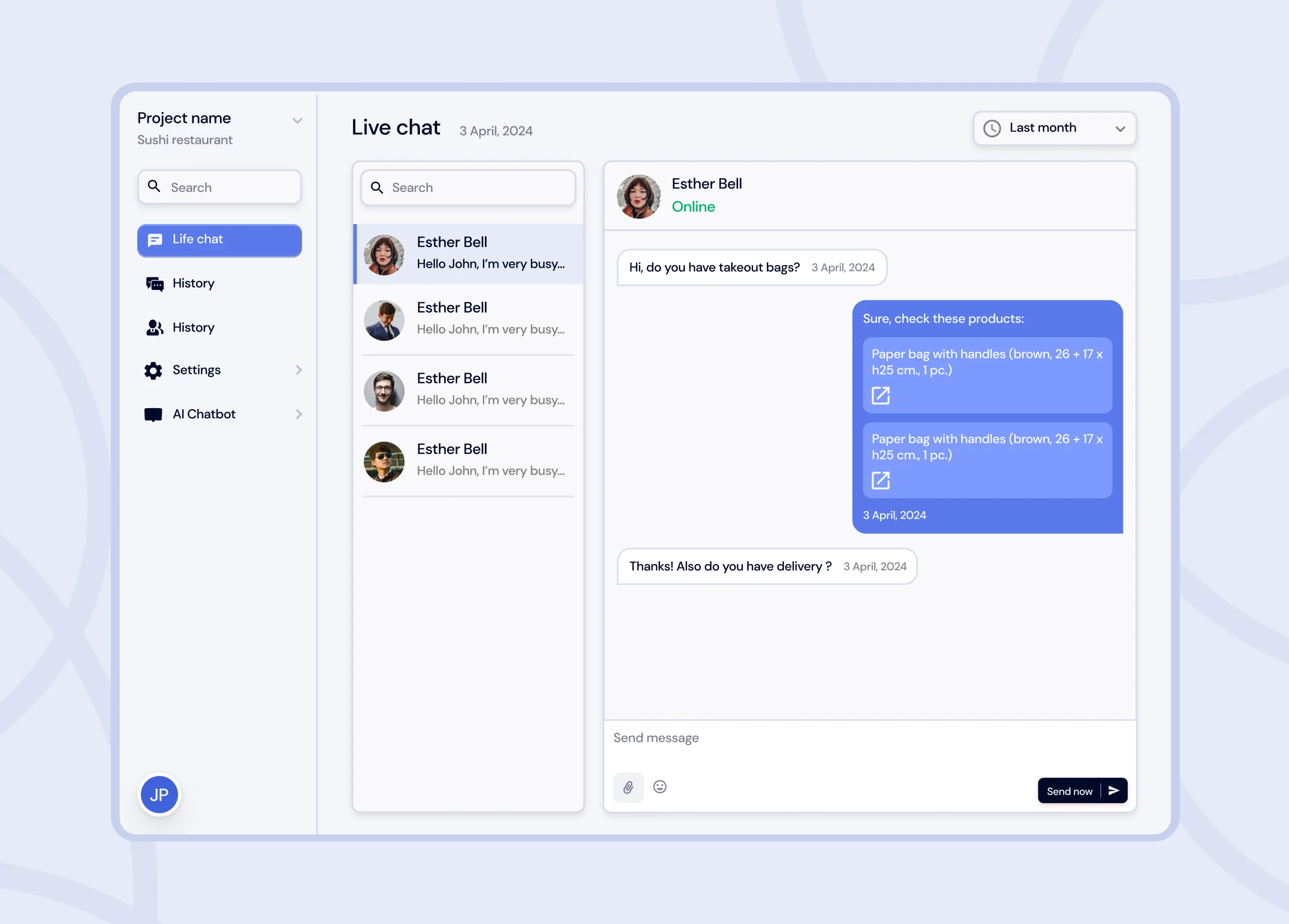
Once we had the necessary insights, we moved on to sketching the website's structure. The goal was to: Create a seamless, intuitive user journey, ensuring that visitors could easily navigate the site and understand Upbeat's value proposition. With the structure defined, we moved to high-fidelity design, incorporating Upbeat's fresh branding into UI.
Result
The Result: The redesigned Upbeat website exceeded expectations, delivering on every key objective. Here's a breakdown of the results: Higher Conversion Rates, competitive Edge, Improved SEO Performance
We met a tight deadline, and no design was sacrificed for speed. Occasionally throughout my career I work with someone that I know will have a wonderful career of their own, and this is one of those occasions. I am already looking forward to another project so that I can involve Integritas again
